
Case study // Smart City & Data

Paris For You, a web app of personalised tourist flows: relieving saturated sites with transactional and geographic data.

Client
City of Paris • Mastercard • NUMA • Tourist Office (OTCP) • APUR
Role
Senior Product Designer (MFG Labs × ekino)
Squad
Senior Product Designer (Josselin) paired with 1 Junior Designer • 1 Data Scientist • 1 Data Engineer • 2 Front-End Devs • 1 PM
Duration
4 months • February → June 2019 (Demoday on 12 June 2019)
Stack
Mapbox GL • Paris Open Data • Clustering algorithms • 2-hour in-situ tests
  • IIID Silver Award 2020 (Data & Design)
  • Presented at Paris City Hall
  • Beta version on parisinfo.com
Paris For You app interface: profile selection and discovery route on a Mapbox map.(new tab)Partner: DataCity NUMA
↳ Paris For You: algorithmic complexity hidden behind a clean interface with 3 simple parameters.
Executive scan // 90 seconds

Mission summary & impact

01 // The challenges
  • Exploiting massive data. Translate millions of transactional (Mastercard) and geographic (APUR, City of Paris) records without drowning users in indigestible charts.
  • Saturated urban flows. Redirect part of the tourist flow (80% concentrated on 5 major sites) towards alternative neighbourhoods and local shops.
  • Technical feasibility & deadlines. Reconcile a complex clustering algorithm with Mapbox call quotas and display latency, under a strict 4-month constraint.
02 // The approach
  • Research & persona. 5 days of immersion and interviews with hotel concierges and American tourists to model the synthesis persona Jeff.
  • Scoping & data science dialogue. Co-design within a hybrid squad (Design × Data Science at MFG Labs) to limit the interface to 3 intuitive filters: start point, time, interests.
  • Prototyping & in-situ test. Clean Mapbox UI Kit and a real-conditions test protocol: a 2-hour autonomous walk in Paris.
03 // The outcome
  • International recognition. Silver Award from the International Institute for Information Design (IIID) in 2020 for combining data science and information design.
  • Institutional validation. Live demonstration at the Paris City Hall Demoday (12 June 2019), in front of city officials and Mastercard leadership.
  • Real-world release. Beta version hosted on the Tourist Office’s official portal (parisinfo.com).
  • 4 monthsfrom upfront scoping to the official Demoday at City Hall
  • 2 hof in-situ walking in the streets of Paris for each tester
  • 9real frictions mapped to drive the PM backlog
  • SilverIIID Award 2020 recognising the data & information design alliance
01 // Strategic framing

Setting the scene: the DataCity open innovation challenge

Turning heterogeneous transactional and urban data into a public service that relieves tourist congestion.

As part of the DataCity urban innovation programme (NUMA × City of Paris), Mastercard and the City of Paris wanted to reconcile tourist influx with residents’ quality of life. 80% of the 30 million annual visitors concentrate on only 5 historic sites. The challenge: design a personalised predictive service encouraging visitors to explore less-visited neighbourhoods while supporting local commerce.

The 3 mandates of the design mission:

  1. Make data actionable. Translate millions of bank transactions and Open Data polygons into immediate, desirable walk recommendations.

  2. Hide the algorithmic plumbing. Reject 48-coefficient dashboards: offer a light interface that renders within Mapbox’s one-second threshold.

  3. Prove it on the Paris pavement. Get out of air-conditioned labs: test the service on a 2-hour autonomous walk in the streets with real tourists.
demoday-hotel-de-ville.paris
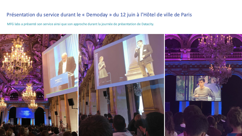
Official presentation of Paris For You at the Demoday at Paris City Hall on 12 June 2019.Official Demoday // 12 June 2019Paris City Hall: debrief in front of city officials and Mastercard.(new tab)
“The point is not to collect more data, but to empower visitors and citizens to take ownership of the city responsibly.”
Official DataCity debrief, Paris City Hall
Organisation & governance

Organisation & governance: the hybrid MFG Labs squad, Data Science × Interaction Design

UX design & mentoring

Josselin Hillion (Senior Product Designer) paired with 1 Junior Designer (ekino × MFG Labs): field immersion, persona Jeff, Mapbox UI Kit, 3-step in-situ protocol and methodology transfer.

Data science & engineering

1 Data Scientist and 1 Data Engineer at MFG Labs: aggregation of Mastercard and APUR data, distance metrics and POI clustering model.

Front-end & delivery

2 Front-End Developers and 1 Product Manager: Mapbox GL integration, API request optimisation, Lean MVP scoping and Beta release on parisinfo.com.

Act 01 // February 2019Phase 1/4

Field immersion & “Jeff came to Paris” storyboard

Identify the real barriers to tourist mobility with hotel concierges and international visitors.

Facing partners with millions of anonymised transactional records, the initial temptation was to build a technical product driven by pure statistics. Our design priority was to go straight into the field: 5 days of immersion and qualitative interviews with hotel concierges and American tourists.

This research revealed a paradox: visitors sincerely want to get off the beaten track, but fear wasting time or ending up in charmless areas. We modelled the synthesis persona Jeff and formalised the full narrative storyboard “Jeff came to Paris”, aligning institutional partners and the technical team.

  • 5 days of field immersion
  • Persona Jeff
  • Storyboard Jeff came to Paris
  • Barrier mapping
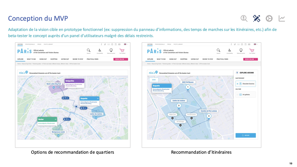
↳ Pragmatic trade-off: simplify features to guarantee sub-second display.
Act 02 // March 2019Phase 2/4

UX/UI design & dialogue with Data Science

Reduce algorithmic complexity to 3 simple filters and build a highly responsive Mapbox map UI Kit.

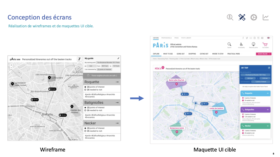
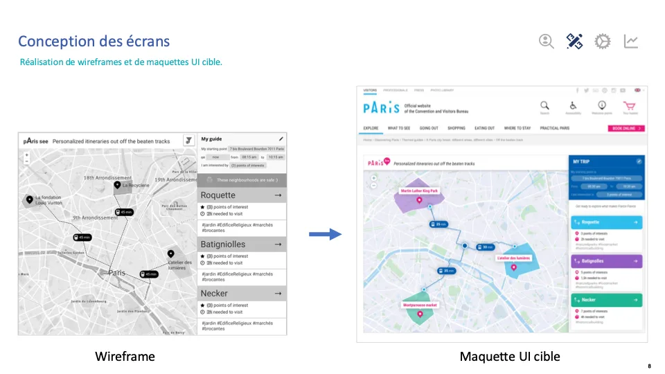
Working closely with the MFG Labs Data Scientists, we defined the rules for visually translating transactional data. While the engineers considered exposing many sliders and coefficients, I made a radical ergonomic call: limit user configuration to 3 simple filters, the starting point, the available time and the interests.

In parallel, we designed a custom UI Kit integrated into the Mapbox map engine: clean map styles, smooth micro-interactions and light points-of-interest cards to guarantee instant display under the critical one-second threshold.

  • 3 filters: start, time, interests
  • Mapbox UI Kit
  • Wireframes & target mock-ups
↳ From wireframe structure to the clean Mapbox interface connected to POI clusters.
Act 03 // April – May 2019Phase 3/4

In-situ reality check: 2 hours walking in Paris

Prove the algorithm on the Paris pavement through a 3-step protocol: 40 min lab, 2 h real visit and 20 min debrief.

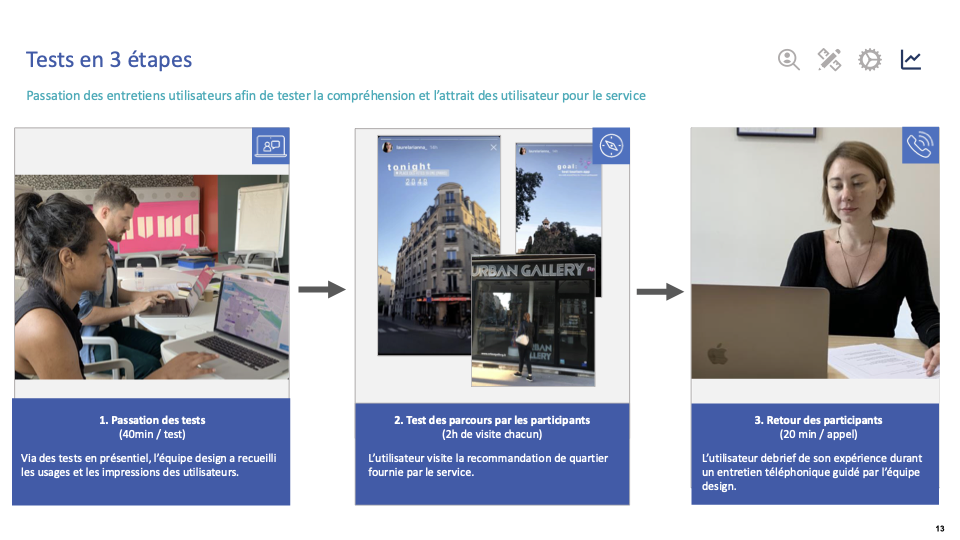
We designed and deployed an original in-situ test protocol with a panel of 10 American residents: a 40-minute initial hands-on session, followed by two hours of real, autonomous walking in Paris guided by the web app, then a 20-minute phone debrief.

This reality check revealed crucial insights: user trust did not depend on fear of surveillance (no rejection of personal data), but on a need for explainability (“Why is this place suggested to me?”) and above all reliable qualitative information (real opening hours, prices, photos, transport). This test also inspired the fallback feature: a light PDF travel notebook, downloadable 100% offline, to avoid costly 4G roaming plans.

  • 3-step in-situ protocol
  • Panel of 10 American residents
  • Matrix of 9 frictions
↳ The in-situ test protocol that fed the matrix of 9 real frictions.
Act 04 // June 2019 & 2020Phase 4/4

City Hall debrief & IIID Award recognition

Validate the impact with institutional partners and get the alliance between Data Science and information design recognised.

The project ended with a live demonstration of the working service at the official Demoday at Paris City Hall on 12 June 2019, in front of city officials, Mastercard leadership and the NUMA ecosystem. The clarity of the recommendations and the restraint of the interface won immediate buy-in.

The web app was then released in Beta on the Tourist Office’s official portal (parisinfo.com). In June 2020, the project received international recognition: the Silver Award from the International Institute for Information Design (IIID), rewarding an exemplary articulation of user research, massive data and interaction design.

  • Live demo at Demoday
  • PM prioritisation matrix
  • Beta release on parisinfo.com
  • IIID Silver Award 2020
↳ Official presentation of Paris For You under the gilded ceilings of Paris City Hall.
Level 4 // Senior mastery

The 4 drawers

❖ Data & UXDesign × Data Science dialogue3-filter trade-off, co-defined distance metrics and Mapbox latency thresholds

Radical simplification. UX trade-off: keep only 3 filters visible instead of the dozens of mathematical coefficients the data scientists wanted to expose.

  • Co-defined metrics: working hand in hand with the data team to set distance thresholds consistent with a leisurely walking pace.
  • Latency management: Mapbox API response times capped under one second to avoid drop-offs on the move.
❖ Lean scopingMVP scoping & technical debtPruning step-by-step walking calculation to hit the Demoday deadline

Pragmatic pruning. To hit the 12 June deadline at City Hall, street-by-street walking calculation, too hungry in API requests, was temporarily dropped.

  • Priority on core value: efforts focused on recommending neighbourhood clusters and authentic points-of-interest cards.
  • Deliver on time: a 100% stable, working demonstrator on the day in front of the executive committee and city officials.
❖ Reality CheckField truth & explainability9 frictions mapped: the issue is not privacy but explainability and reassurance
  • Explainability first: the street test proved that the first barrier is not surveillance but incomprehension: “Why is this place suggested to me?”.
  • Blocking qualitative reassurance: without reliable opening hours, photos, prices and crowding, the algorithmic recommendation is dead letter (major friction).
  • Offline fallback feature: a light PDF travel notebook to answer foreign visitors’ immediate 4G drop-outs.
❖ Critical hindsightWhat I would do differentlyStructure Data Science × Front-End Dev interface contracts earlier

In an innovation project pairing data scientists and front-end developers, handing over data schemas sometimes caused format frictions. With hindsight, I would have introduced strict OpenAPI interface contracts from sprint 1 and twice-weekly sync reviews to smooth the integration of clusters into Mapbox.

🎯 The so what? // What this case shows for your products
01 // High data density

Turning massive flows into simple decisions

Proven ability to work with data and backend engineers to turn massive volumes of events and statistics into a clear, responsive interface with no perceptible latency.

02 // Delivery pragmatism & MVP

Trim to test rather than lock yourself in

Knowing how to prune the target vision to ship a working MVP in a very short time (4 months), making it possible to test on the pavement before committing to heavy development.

03 // System explainability

Making invisible intelligence understandable

Raw algorithm performance is not enough: for a user to act, the system must make its criteria readable and give them the evidence to decide with confidence.

Ready to clarify your data architectures or map applications?